

How Can Businesses Create a Business Card That Gets Noticed?
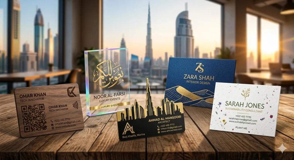
A business card may be small, but it can still play an important role in a professional introduction. Whether exchanged at a networking event, handed to a potential client, or left at a business meeting, a well-designed card gives people something physical to remember.
The challenge is making a business card noticeable without making it confusing. A strong design does not necessarily require unusual shapes, excessive colors, or complicated graphics. Clear information, thoughtful typography, suitable materials, and a memorable visual detail can often make a bigger difference.
Businesses looking for inspiration can explore creative business card ideas that get noticed in dubai before deciding which design direction fits their brand and audience.
Start With the Most Important Information
A business card has limited space, so every element should have a purpose. The basic information usually includes:
- Business or personal name
- Job title or role
- Company name
- Phone number
- Email address
- Website
- Business location, when relevant
- Social media or professional profile
The most important details should be easy to find at a glance. If a person has to search through several decorative elements to find a phone number or website, the design is doing too much.
A useful approach is to decide on one primary piece of information and build the hierarchy around it. For a personal networking card, that might be the person's name. For a company representative, it could be the company identity.
Use Typography to Create a Clear Hierarchy
Typography can make a simple business card look much more professional.
Instead of using several unrelated fonts, choose one or two complementary typefaces. The name can be larger, while contact information remains smaller but comfortably readable.
Avoid extremely decorative fonts for essential information. A creative typeface might work well for a logo or heading, but small contact details need clarity.
Spacing also matters. Leaving enough empty space around text prevents the card from looking crowded and gives each element room to stand out.
Add One Memorable Design Element
A business card does not need ten creative features to become memorable. One distinctive element can be enough.
For example, a designer might use:
- A simple geometric pattern
- A unique color combination
- A subtle texture
- A distinctive logo treatment
- A vertical layout
- A small spot of contrasting color
- A minimalist illustration
The key is consistency. The creative element should support the company's identity rather than compete with the contact information.
Consider an Unusual Layout
The traditional horizontal business card remains practical, but it is not the only option.
A vertical layout can create a different visual impression while still providing enough room for essential details. Another approach is to divide the front and back of the card into different functions.
For example, the front might contain the person's name and company identity, while the back provides contact information or a short description of the service.
A two-sided design can be particularly useful when there is more information to communicate but not enough space to fit everything comfortably on one side.
Choose Materials Carefully
The material of a business card affects how it looks and feels.
Standard coated or uncoated card stock may be appropriate for everyday networking. Thicker stock can create a more substantial feel, while textured materials can add visual and tactile interest.
The choice should match the type of business. A creative agency may have more freedom to experiment with unusual finishes, while a professional services company may prefer a restrained and formal appearance.
Before ordering a large quantity, requesting a physical sample can help reveal differences between the digital design and the finished printed product.
Use Color With Purpose
Color can make a card noticeable, but using too many colors can have the opposite effect.
A simple palette of one primary color, one supporting color, and a neutral background can create a clean appearance. Contrast should be strong enough for text to remain readable.
For businesses operating in Dubai, it may also be useful to consider how the card fits within the company's existing branding. If the website, signage, social profiles, and packaging use a particular color system, the business card should feel like part of the same visual identity.
Make the Back of the Card Useful
The back of a business card is often left blank, but it can provide valuable space.
Instead of filling it with repeated contact information, consider using it for something that gives the recipient a reason to keep the card.
A QR code can link to a website, portfolio, booking page, digital menu, or professional profile. A short service list can also work when the business offers a small number of clearly defined services.
The QR code should be tested before printing. It also needs enough clear space around it to remain easy for smartphones to scan.
Think About Printing Before Finalizing the Design
A design that looks excellent on a computer screen may not always produce the same result in print.
Before production, check the document dimensions, bleed, image resolution, colors, and font formatting. Small text should be tested carefully because it may become less readable when printed.
It is also worth considering how finishes will affect the design. Glossy surfaces can change how colors and reflections appear, while textured or matte materials may produce a softer visual effect.
Zahrat Al Madina Printing is one Dubai-based printing business that can be considered when researching local options for business cards and other printed materials.
Avoid Common Business Card Mistakes
Some design problems appear repeatedly because businesses try to include too much information.
Avoid:
Overcrowding: A card should not look like a miniature brochure.
Tiny text: Important contact details need to remain readable.
Low-quality images: Blurry logos or photographs can make an otherwise good design look unprofessional.
Too many fonts: Multiple typefaces can make the visual hierarchy unclear.
Unnecessary information: Include details that help the recipient understand or contact the business.
Unclear QR codes: Always test the printed version rather than assuming it will scan correctly.
Conclusion
A noticeable business card does not have to be complicated. The strongest designs usually combine clear information, readable typography, consistent branding, and one or two carefully selected creative details.
Before sending a design to print, consider how the card will be used, who will receive it, and what information needs to be remembered. A thoughtful layout and suitable material can turn a small piece of printed paper into a useful reminder of a professional connection long after the initial meeting.
FAQs
1. What makes a business card stand out?
A clear layout combined with one memorable element, such as an unusual format, distinctive color, texture, or simple graphic, can make a business card more memorable without making it difficult to read.
2. Should a business card have information on both sides?
It can. Using both sides provides more space while keeping the front uncluttered. The back can be used for a QR code, service information, portfolio link, or another useful element.
3. What information should always appear on a business card?
At minimum, include the person's or business's name, relevant contact details, and enough information for the recipient to understand who they are dealing with.
4. Are thicker business cards better?
Thickness is a design and budget consideration rather than a universal requirement. A heavier card can feel different in the hand, but a well-designed standard card can also communicate professionalism effectively.
5. Should businesses use QR codes on business cards?
A QR code can be useful when it leads to a relevant digital destination, such as a website, portfolio, booking page, or contact profile. It should be tested before printing and should not replace essential contact information.

 English
 Arabic
 French
 Spanish
 Portuguese
 Deutsch
 Turkish
 Dutch
Dutch
 Italiano
 Romaian
 Portuguese (Brazil)
 Greek
Greek