
Understanding the Difference Between Typeface and Font
In typography, the words typeface and font are often used as if they mean the same thing. While they are closely connected, they describe different parts of how written text looks. Understanding the difference between a typeface and a font can help beginners make better choices for websites, documents, logos, social media posts, and graphic design projects. Once you understand these basic typography terms, choosing the right text style becomes much easier.
What Is a Typeface?
A typeface is the overall design or visual style of a group of letters, numbers, and symbols. It describes the appearance and character of the lettering rather than one particular size or version. For example, Helvetica, Garamond, and Times New Roman are typefaces.
A typeface can have many variations, including different weights, widths, and styles. Think of a typeface as a complete design family. The shapes of the letters, the curves, spacing, and overall appearance are what make one typeface different from another.
For example, a serif typeface may have small decorative strokes at the ends of letters, while a sans serif typeface usually has cleaner and simpler shapes.
What Is a Font?
A font is a specific version of a typeface. It traditionally refers to a particular combination of characteristics such as size, weight, and style. For example, Helvetica Bold at a specific size can be considered a font within the Helvetica typeface family.
In modern digital design, however, people commonly use the word "font" to describe the entire typeface. This is why you may hear designers say "choose a font" when they actually mean "choose a typeface."
Digital fonts make it possible to display different lettering styles on computers, phones, websites, and design software. Font formats such as OpenType and TrueType store the information needed for digital text rendering.
Typeface vs. Font: The Main Difference
The easiest way to understand the difference is to think of a typeface as the design family and a font as a specific member or version of that family.
For example:
-
Typeface: Helvetica
-
Font: Helvetica Bold
-
Typeface: Garamond
-
Font: Garamond Italic
-
Typeface: Times New Roman
-
Font: Times New Roman Regular
This distinction is especially useful when working with typography professionally. A designer may select a typeface first and then choose specific fonts from that family to create hierarchy and visual balance.
Why Does This Difference Matter?
Knowing typography terminology can make communication easier between graphic designers, developers, printers, and clients. It also helps when creating a consistent visual identity.
A business might select one typeface for its brand identity and use different font styles from that family for headings, body text, captions, and promotional materials. This creates consistency while still allowing different parts of the design to stand out.
For example, a bold font can make a headline noticeable, while a regular font from the same family can make longer paragraphs comfortable to read.
Choosing the Right Typeface for Your Project
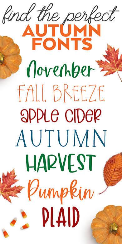
The right typeface depends on the purpose of your content. Serif typefaces can create a traditional, professional, or elegant feeling, while sans serif typefaces often provide a clean and modern appearance. Script and cursive styles can add personality but should be used carefully when readability is important.
For creative projects, experimenting with lettering styles can also help you discover a distinctive look. A Cursive Text Generator, for instance, can be useful when exploring decorative name styles for invitations, personal projects, artwork, or social media designs.
Final Thoughts
The difference between a typeface and a font may seem small, but it is an important part of understanding typography. A typeface represents the overall lettering design, while a font traditionally refers to a specific style or variation within that design. Learning this distinction can help beginners make smarter typography choices and create text that looks professional, attractive, and easy to read.

 English
 Arabic
 Spanish
 Portuguese
 Deutsch
 Turkish
 Dutch
 Italiano
 Russian
 Romaian
 Portuguese (Brazil)
 Greek